Accessible web content doesn’t have to compromise web design – in fact, the two are players on the same team. Accessibility and design actually share a common goal – to achieve a great user experience. In this blog post, we’ll debunk the myth that accessibility compromises web design and explore how to improve web accessibility.
Myth: Web accessibility compromises design
You may assume that implementing accessibility standards will create more work and adversely affect your design. For example, if your brand colours don’t work with high colour contrast expectations. In fact, accessibility actually enhances design. Often the basics of design overlap with elements that improve web accessibility. Accessible content improves the overall user experience and ensures your content is available to all. So you can have websites that are both visually captivating and universally accessible. Let’s start by debunking the myth and see how the two work together.
How contrast makes content appealing and accessible
A foundational element of design is contrast. Contrast is the difference between two or more elements to create visual interest and make elements stand out. Embedding contrast into the design pinpoints where a user should focus on the page and aids navigation. Contrast covers a range of elements:
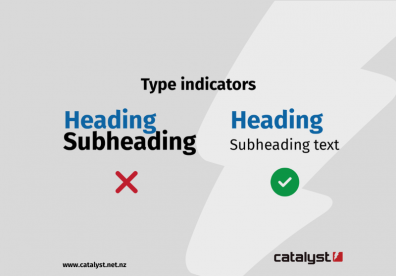
- Scale compares the size of one element to another and can suggest importance. An example of scale is the size of a title compared to the text underneath.
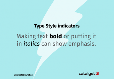
- Type covers everything involved in the appearance of text on the screen. For instance, making text bold or putting it in italics can show emphasis.
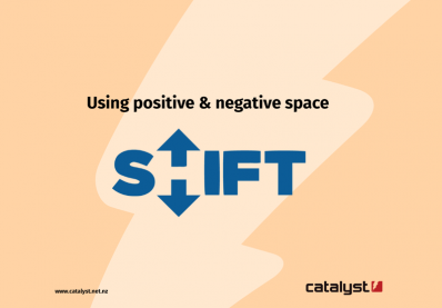
- Space and how it is used creates a focal point on the screen. For example, in a logo, the negative space (the gaps between the letters) draws the focus to the positive space (the design itself).
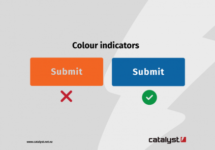
- Colour can express a brand identity, which creates a sense of familiarity for the user. Plus, colour can differentiate sections or elements to showcase their importance. For instance, submit buttons tend to be a blue button on a white background, and links almost always have blue text.
When contrast is used effectively in design, it influences how a user interacts with the content. Contrast can suggest where important elements are on a page, making navigation easier.
If a user has low vision, colour blindness, or the sun is blocking their view, contrast is a great way to make content stand out. Plus, ensuring design elements have a high colour contrast meets WCAG guidelines(external link), making content more accessible. Not only does contrast aid usability, but contrast is also a great way to express creativity and create vibrant and dynamic experiences.
To check the colour contrast of elements, use the contrast checker(external link).
How following a hierarchy influences design and usability
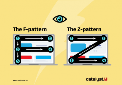
Visual hierarchy is the order a user processes the information on a website. There are two common ways users instinctively view a website:
- The F-pattern is the way a user scans a page to find relevant information when there’s a lot of text on a page.
- The Z-pattern is the way a user scans a page that has more images and less text.
Designers follow these patterns to design websites that are easy to use and understand. Key components such as a navigation bar and a search bar are generally at the top of a page. Following the visual hierarchy principle ensures the designer creates a familiar layout. Good design shouldn't make a user think more than they have to. A familiar layout reduces the cognitive load and makes the experience more enjoyable. This improves the overall experience for everyone, including those with cognitive difficulties, and those who use a screen reader to navigate.
How headings make a difference in accessibility
Another way to establish a visual hierarchy is through the use of headers. Headers make it easier to understand the content of a page by separating content into sections. When scanning a page in either a Z- or F-pattern, a heading will pull the focus and help users understand the context. Headings have a natural hierarchy, and following the hierarchy, H1, H2, H3, and so on, it's easier to understand how topics fit together. Plus, when using a hierarchy in headings, it's easier for someone using a screen reader to navigate between sections.
How accessibility improves design
In 2010, Google popularised mobile-first design as a development method. Mobile-first design is when a website is designed for a mobile device first and then scaled up for larger devices later. In 2023, New Zealanders had more mobile phones than people, with over 6.5 million mobile connections(external link) and 4.99 million internet users(external link). It’s safe to assume the majority of internet users access the web on their mobiles some of the time. Essentially, by considering mobile design upfront, developers can consider the core components and functionalities and create them for a smaller screen. Conversely, designing desktop-first requires removing elements or squashing everything to fit on a smaller screen. This approach can mean organisations need to either create a separate mobile website or completely rebuild it. The limitation in size influences better design, as developers have to be more specific in what they choose and why. This results in improved navigation and usability due to tighter restraints.
At Catalyst, we supported an organisation that wanted to transform its desktop-first website into something more modern and accessible. We embedded accessibility into our design approach at the very beginning of our process. Our holistic approach to accessibility and design delivered a visually attractive and accessible result by designing mobile-first.
How web accessibility impacts user experience
Ensuring your website is accessible means you’re making your content available to a wider range of people. Considering design without accessibility impacts a company’s reputation, as inclusiveness is an expectation for brands, especially when 16% of the world’s population has a disability(external link).
Accessibility improves the user experience for everyone as it enhances the usability and functionality. Following accessibility guidelines and best practices, you can make your website clear, consistent, easy to navigate, and responsive. You can also reduce errors, bugs, and frustrations while providing more options and choices for your users. Therefore, accessibility drives good UX and provides value to all users.
Web accessibility services in New Zealand
In New Zealand, government organisations need their services to be available to everyone, so they must comply with the Web Usability Standard.(external link) Catalyst is an approved supplier for web accessibility on the DIA Marketplace(external link), and we're experienced in working with government requirements to improve accessibility. As part of our accessibility services, we enable organisations to improve their user experience by providing both UX and accessibility audits. To support one government agency on its accessibility journey, we audited its website, and through this, we were able to provide valuable insights by:
- reviewing each page against each user persona provided.
- User personas are examples of the type of user a website has, and each persona interacts with the website differently depending on their needs.
- identifying main themes for issues, including where they were, providing examples, and suggesting solutions to improve accessibility and UX.
- This included a compliance percentage rating against the WCAG 2.2 AA criterion(external link) for each page.
As an organisation, you may know some of your usability issues from user feedback or by experiencing them yourself. However, an audit can both catch areas you may not know about and provide suggestions to improve accessibility. W3C Web Accessibility Initiative (WAI) has an auditing tool(external link) which you can use to run an audit on your website. However, the tool is for experienced accessibility evaluators. If you don’t have the resources to perform an audit or act on any findings, our web accessibility services can enable you to achieve your accessibility goals.
Contact us to learn how to improve web accessibility in your design today.